Table of Contents
- QTabBar
- Synopsis
- Detailed Description
PySide2.QtWidgets.QTabBarPySide2.QtWidgets.QTabBar.ShapePySide2.QtWidgets.QTabBar.ButtonPositionPySide2.QtWidgets.QTabBar.SelectionBehaviorPySide2.QtWidgets.QTabBar.accessibleTabName()PySide2.QtWidgets.QTabBar.addTab()PySide2.QtWidgets.QTabBar.autoHide()PySide2.QtWidgets.QTabBar.changeCurrentOnDrag()PySide2.QtWidgets.QTabBar.count()PySide2.QtWidgets.QTabBar.currentChanged()PySide2.QtWidgets.QTabBar.currentIndex()PySide2.QtWidgets.QTabBar.documentMode()PySide2.QtWidgets.QTabBar.drawBase()PySide2.QtWidgets.QTabBar.elideMode()PySide2.QtWidgets.QTabBar.expanding()PySide2.QtWidgets.QTabBar.iconSize()PySide2.QtWidgets.QTabBar.initStyleOption()PySide2.QtWidgets.QTabBar.insertTab()PySide2.QtWidgets.QTabBar.isMovable()PySide2.QtWidgets.QTabBar.isTabEnabled()PySide2.QtWidgets.QTabBar.isTabVisible()PySide2.QtWidgets.QTabBar.minimumTabSizeHint()PySide2.QtWidgets.QTabBar.moveTab()PySide2.QtWidgets.QTabBar.removeTab()PySide2.QtWidgets.QTabBar.selectionBehaviorOnRemove()PySide2.QtWidgets.QTabBar.setAccessibleTabName()PySide2.QtWidgets.QTabBar.setAutoHide()PySide2.QtWidgets.QTabBar.setChangeCurrentOnDrag()PySide2.QtWidgets.QTabBar.setCurrentIndex()PySide2.QtWidgets.QTabBar.setDocumentMode()PySide2.QtWidgets.QTabBar.setDrawBase()PySide2.QtWidgets.QTabBar.setElideMode()PySide2.QtWidgets.QTabBar.setExpanding()PySide2.QtWidgets.QTabBar.setIconSize()PySide2.QtWidgets.QTabBar.setMovable()PySide2.QtWidgets.QTabBar.setSelectionBehaviorOnRemove()PySide2.QtWidgets.QTabBar.setShape()PySide2.QtWidgets.QTabBar.setTabButton()PySide2.QtWidgets.QTabBar.setTabData()PySide2.QtWidgets.QTabBar.setTabEnabled()PySide2.QtWidgets.QTabBar.setTabIcon()PySide2.QtWidgets.QTabBar.setTabText()PySide2.QtWidgets.QTabBar.setTabTextColor()PySide2.QtWidgets.QTabBar.setTabToolTip()PySide2.QtWidgets.QTabBar.setTabVisible()PySide2.QtWidgets.QTabBar.setTabWhatsThis()PySide2.QtWidgets.QTabBar.setTabsClosable()PySide2.QtWidgets.QTabBar.setUsesScrollButtons()PySide2.QtWidgets.QTabBar.shape()PySide2.QtWidgets.QTabBar.tabAt()PySide2.QtWidgets.QTabBar.tabBarClicked()PySide2.QtWidgets.QTabBar.tabBarDoubleClicked()PySide2.QtWidgets.QTabBar.tabButton()PySide2.QtWidgets.QTabBar.tabCloseRequested()PySide2.QtWidgets.QTabBar.tabData()PySide2.QtWidgets.QTabBar.tabIcon()PySide2.QtWidgets.QTabBar.tabInserted()PySide2.QtWidgets.QTabBar.tabLayoutChange()PySide2.QtWidgets.QTabBar.tabMoved()PySide2.QtWidgets.QTabBar.tabRect()PySide2.QtWidgets.QTabBar.tabRemoved()PySide2.QtWidgets.QTabBar.tabSizeHint()PySide2.QtWidgets.QTabBar.tabText()PySide2.QtWidgets.QTabBar.tabTextColor()PySide2.QtWidgets.QTabBar.tabToolTip()PySide2.QtWidgets.QTabBar.tabWhatsThis()PySide2.QtWidgets.QTabBar.tabsClosable()PySide2.QtWidgets.QTabBar.usesScrollButtons()
Previous topic
Next topic
QTabBar
Synopsis
Functions
def
accessibleTabName(index)def
addTab(icon, text)def
addTab(text)def
autoHide()def
changeCurrentOnDrag()def
count()def
currentIndex()def
documentMode()def
drawBase()def
elideMode()def
expanding()def
iconSize()def
initStyleOption(option, tabIndex)def
insertTab(index, icon, text)def
insertTab(index, text)def
isMovable()def
isTabEnabled(index)def
isTabVisible(index)def
moveTab(from, to)def
removeTab(index)def
selectionBehaviorOnRemove()def
setAccessibleTabName(index, name)def
setAutoHide(hide)def
setChangeCurrentOnDrag(change)def
setDocumentMode(set)def
setDrawBase(drawTheBase)def
setElideMode(mode)def
setExpanding(enabled)def
setIconSize(size)def
setMovable(movable)def
setSelectionBehaviorOnRemove(behavior)def
setShape(shape)def
setTabButton(index, position, widget)def
setTabData(index, data)def
setTabEnabled(index, enabled)def
setTabIcon(index, icon)def
setTabText(index, text)def
setTabTextColor(index, color)def
setTabToolTip(index, tip)def
setTabVisible(index, visible)def
setTabWhatsThis(index, text)def
setTabsClosable(closable)def
setUsesScrollButtons(useButtons)def
shape()def
tabAt(pos)def
tabButton(index, position)def
tabData(index)def
tabIcon(index)def
tabRect(index)def
tabText(index)def
tabTextColor(index)def
tabToolTip(index)def
tabWhatsThis(index)def
tabsClosable()def
usesScrollButtons()
Virtual functions
def
minimumTabSizeHint(index)def
tabInserted(index)def
tabLayoutChange()def
tabRemoved(index)def
tabSizeHint(index)
Slots
def
setCurrentIndex(index)
Signals
def
currentChanged(index)def
tabBarClicked(index)def
tabBarDoubleClicked(index)def
tabCloseRequested(index)def
tabMoved(from, to)
Detailed Description
QTabBaris straightforward to use; it draws the tabs using one of the predefinedshapes, and emits a signal when a tab is selected. It can be subclassed to tailor the look and feel. Qt also provides a ready-madeQTabWidget.Each tab has a
tabText(), an optionaltabIcon(), an optionaltabToolTip(), optionaltabWhatsThis()and optionaltabData(). The tabsвҖҷs attributes can be changed withsetTabText(),setTabIcon(),setTabToolTip(),setTabWhatsThisandsetTabData(). Each tabs can be enabled or disabled individually withsetTabEnabled().Each tab can display text in a distinct color. The current text color for a tab can be found with the
tabTextColor()function. Set the text color for a particular tab withsetTabTextColor().Tabs are added using
addTab(), or inserted at particular positions usinginsertTab(). The total number of tabs is given bycount(). Tabs can be removed from the tab bar withremoveTab(). CombiningremoveTab()andinsertTab()allows you to move tabs to different positions.The
shapeproperty defines the tabsвҖҷ appearance. The choice of shape is a matter of taste, although tab dialogs (for preferences and similar) invariably useRoundedNorth. Tab controls in windows other than dialogs almost always use eitherRoundedSouthorTriangularSouth. Many spreadsheets and other tab controls in which all the pages are essentially similar useTriangularSouth, whereasRoundedSouthis used mostly when the pages are different (e.g. a multi-page tool palette). The default inQTabBarisRoundedNorth.The most important part of
QTabBarвҖҳs API is thecurrentChanged()signal. This is emitted whenever the current tab changes (even at startup, when the current tab changes from вҖҳnoneвҖҷ). There is also a slot,setCurrentIndex(), which can be used to select a tab programmatically. The functioncurrentIndex()returns the index of the current tab,countholds the number of tabs.
QTabBarcreates automatic mnemonic keys in the manner ofQAbstractButton; e.g. if a tabвҖҷs label is вҖң&GraphicsвҖқ, Alt+G becomes a shortcut key for switching to that tab.The following virtual functions may need to be reimplemented in order to tailor the look and feel or store extra data with each tab:
tabSizeHint()calcuates the size of a tab.
tabInserted()notifies that a new tab was added.
tabRemoved()notifies that a tab was removed.
tabLayoutChange()notifies that the tabs have been re-laid out.
paintEvent()paints all tabs.For subclasses, you might also need the
tabRect()functions which returns the visual geometry of a single tab.
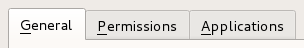
A tab bar shown in the Fusion widget style .
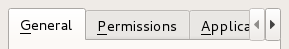
A truncated tab bar shown in the Fusion widget style.
See also
- class PySide2.QtWidgets.QTabBar([parent=None])В
- param parent:
Creates a new tab bar with the given
parent.
- PySide2.QtWidgets.QTabBar.Shape
This enum type lists the built-in shapes supported by
QTabBar. Treat these as hints as some styles may not render some of the shapes. However, position should be honored.Constant
Description
QTabBar.RoundedNorth
The normal rounded look above the pages
QTabBar.RoundedSouth
The normal rounded look below the pages
QTabBar.RoundedWest
The normal rounded look on the left side of the pages
QTabBar.RoundedEast
The normal rounded look on the right side the pages
QTabBar.TriangularNorth
Triangular tabs above the pages.
QTabBar.TriangularSouth
Triangular tabs similar to those used in the Excel spreadsheet, for example
QTabBar.TriangularWest
Triangular tabs on the left of the pages.
QTabBar.TriangularEast
Triangular tabs on the right of the pages.
- PySide2.QtWidgets.QTabBar.ButtonPosition
This enum type lists the location of the widget on a tab.
Constant
Description
QTabBar.LeftSide
Left side of the tab.
QTabBar.RightSide
Right side of the tab.
- PySide2.QtWidgets.QTabBar.SelectionBehavior
This enum type lists the behavior of
QTabBarwhen a tab is removed and the tab being removed is also the current tab.Constant
Description
QTabBar.SelectLeftTab
Select the tab to the left of the one being removed.
QTabBar.SelectRightTab
Select the tab to the right of the one being removed.
QTabBar.SelectPreviousTab
Select the previously selected tab.
- PySide2.QtWidgets.QTabBar.accessibleTabName(index)В
- Parameters:
index вҖ“ int
- Return type:
str
Returns the
accessibleNameof the tab at positionindex, or an empty string ifindexis out of range.See also
- PySide2.QtWidgets.QTabBar.addTab(icon, text)В
- Parameters:
icon вҖ“
PySide2.QtGui.QIcontext вҖ“ str
- Return type:
int
This is an overloaded function.
Adds a new tab with icon
iconand texttext. Returns the new tabвҖҷs index.
- PySide2.QtWidgets.QTabBar.addTab(text)
- Parameters:
text вҖ“ str
- Return type:
int
Adds a new tab with text
text. Returns the new tabвҖҷs index.
- PySide2.QtWidgets.QTabBar.autoHide()В
- Return type:
bool
This property holds If true, the tab bar is automatically hidden when it contains less than 2 tabs..
By default, this property is false.
See also
visible
- PySide2.QtWidgets.QTabBar.changeCurrentOnDrag()В
- Return type:
bool
This property holds If true, then the current tab is automatically changed when dragging over the tabbar..
Note
You should also set
acceptDropsproperty to true to make this feature work.By default, this property is false.
- PySide2.QtWidgets.QTabBar.count()В
- Return type:
int
This property holds the number of tabs in the tab bar.
- PySide2.QtWidgets.QTabBar.currentChanged(index)В
- Parameters:
index вҖ“ int
- PySide2.QtWidgets.QTabBar.currentIndex()В
- Return type:
int
This property holds the index of the tab barвҖҷs visible tab.
The current index is -1 if there is no current tab.
- PySide2.QtWidgets.QTabBar.documentMode()В
- Return type:
bool
This property holds Whether or not the tab bar is rendered in a mode suitable for the main window..
This property is used as a hint for styles to draw the tabs in a different way then they would normally look in a tab widget. On macOS this will look similar to the tabs in Safari or SierraвҖҷs Terminal.app.
See also
- PySide2.QtWidgets.QTabBar.drawBase()В
- Return type:
bool
This property defines whether or not tab bar should draw its base..
If true then
QTabBardraws a base in relation to the styles overlab. Otherwise only the tabs are drawn.See also
pixelMetric()PM_TabBarBaseOverlapQStyleOptionTabBarBase
- PySide2.QtWidgets.QTabBar.elideMode()В
- Return type:
This property holds how to elide text in the tab bar.
This property controls how items are elided when there is not enough space to show them for a given tab bar size.
By default the value is style-dependent.
See also
elideModeusesScrollButtonsSH_TabBar_ElideMode
- PySide2.QtWidgets.QTabBar.expanding()В
- Return type:
bool
This property holds When expanding is true
QTabBarwill expand the tabs to use the empty space..By default the value is true.
See also
- PySide2.QtWidgets.QTabBar.iconSize()В
- Return type:
This property holds The size for icons in the tab bar.
The default value is style-dependent.
iconSizeis a maximum size; icons that are smaller are not scaled up.See also
- PySide2.QtWidgets.QTabBar.initStyleOption(option, tabIndex)В
- Parameters:
option вҖ“
PySide2.QtWidgets.QStyleOptionTabtabIndex вҖ“ int
Initialize
optionwith the values from the tab attabIndex. This method is useful for subclasses when they need aQStyleOptionTab, but donвҖҷt want to fill in all the information themselves.See also
- PySide2.QtWidgets.QTabBar.insertTab(index, icon, text)В
- Parameters:
index вҖ“ int
icon вҖ“
PySide2.QtGui.QIcontext вҖ“ str
- Return type:
int
This is an overloaded function.
Inserts a new tab with icon
iconand texttextat positionindex. Ifindexis out of range, the new tab is appended. Returns the new tabвҖҷs index.If the
QTabBarwas empty before this function is called, the inserted tab becomes the current tab.Inserting a new tab at an index less than or equal to the current index will increment the current index, but keep the current tab.
- PySide2.QtWidgets.QTabBar.insertTab(index, text)
- Parameters:
index вҖ“ int
text вҖ“ str
- Return type:
int
Inserts a new tab with text
textat positionindex. Ifindexis out of range, the new tab is appened. Returns the new tabвҖҷs index.
- PySide2.QtWidgets.QTabBar.isMovable()В
- Return type:
bool
This property holds This property holds whether the user can move the tabs within the tabbar area..
By default, this property is
false;
- PySide2.QtWidgets.QTabBar.isTabEnabled(index)В
- Parameters:
index вҖ“ int
- Return type:
bool
Returns
trueif the tab at positionindexis enabled; otherwise returnsfalse.
- PySide2.QtWidgets.QTabBar.isTabVisible(index)В
- Parameters:
index вҖ“ int
- Return type:
bool
Returns true if the tab at position
indexis visible; otherwise returns false.
- PySide2.QtWidgets.QTabBar.minimumTabSizeHint(index)В
- Parameters:
index вҖ“ int
- Return type:
Returns the minimum tab size hint for the tab at position
index.
- PySide2.QtWidgets.QTabBar.moveTab(from, to)В
- Parameters:
from вҖ“ int
to вҖ“ int
Moves the item at index position
fromto index positionto.See also
- PySide2.QtWidgets.QTabBar.removeTab(index)В
- Parameters:
index вҖ“ int
Removes the tab at position
index.See also
SelectionBehavior
- PySide2.QtWidgets.QTabBar.selectionBehaviorOnRemove()В
- Return type:
This property holds What tab should be set as current when
removeTabis called if the removed tab is also the current tab..By default the value is
SelectRightTab.See also
- PySide2.QtWidgets.QTabBar.setAccessibleTabName(index, name)В
- Parameters:
index вҖ“ int
name вҖ“ str
Sets the
accessibleNameof the tab at positionindextoname.See also
- PySide2.QtWidgets.QTabBar.setAutoHide(hide)В
- Parameters:
hide вҖ“ bool
This property holds If true, the tab bar is automatically hidden when it contains less than 2 tabs..
By default, this property is false.
See also
visible
- PySide2.QtWidgets.QTabBar.setChangeCurrentOnDrag(change)В
- Parameters:
change вҖ“ bool
This property holds If true, then the current tab is automatically changed when dragging over the tabbar..
Note
You should also set
acceptDropsproperty to true to make this feature work.By default, this property is false.
- PySide2.QtWidgets.QTabBar.setCurrentIndex(index)В
- Parameters:
index вҖ“ int
This property holds the index of the tab barвҖҷs visible tab.
The current index is -1 if there is no current tab.
- PySide2.QtWidgets.QTabBar.setDocumentMode(set)В
- Parameters:
set вҖ“ bool
This property holds Whether or not the tab bar is rendered in a mode suitable for the main window..
This property is used as a hint for styles to draw the tabs in a different way then they would normally look in a tab widget. On macOS this will look similar to the tabs in Safari or SierraвҖҷs Terminal.app.
See also
- PySide2.QtWidgets.QTabBar.setDrawBase(drawTheBase)В
- Parameters:
drawTheBase вҖ“ bool
This property defines whether or not tab bar should draw its base..
If true then
QTabBardraws a base in relation to the styles overlab. Otherwise only the tabs are drawn.See also
pixelMetric()PM_TabBarBaseOverlapQStyleOptionTabBarBase
- PySide2.QtWidgets.QTabBar.setElideMode(mode)В
- Parameters:
mode вҖ“
TextElideMode
This property holds how to elide text in the tab bar.
This property controls how items are elided when there is not enough space to show them for a given tab bar size.
By default the value is style-dependent.
See also
elideModeusesScrollButtonsSH_TabBar_ElideMode
- PySide2.QtWidgets.QTabBar.setExpanding(enabled)В
- Parameters:
enabled вҖ“ bool
This property holds When expanding is true
QTabBarwill expand the tabs to use the empty space..By default the value is true.
See also
- PySide2.QtWidgets.QTabBar.setIconSize(size)В
- Parameters:
size вҖ“
PySide2.QtCore.QSize
This property holds The size for icons in the tab bar.
The default value is style-dependent.
iconSizeis a maximum size; icons that are smaller are not scaled up.See also
- PySide2.QtWidgets.QTabBar.setMovable(movable)В
- Parameters:
movable вҖ“ bool
This property holds This property holds whether the user can move the tabs within the tabbar area..
By default, this property is
false;
- PySide2.QtWidgets.QTabBar.setSelectionBehaviorOnRemove(behavior)В
- Parameters:
behavior вҖ“
SelectionBehavior
This property holds What tab should be set as current when
removeTabis called if the removed tab is also the current tab..By default the value is
SelectRightTab.See also
- PySide2.QtWidgets.QTabBar.setShape(shape)В
- Parameters:
shape вҖ“
Shape
This property holds the shape of the tabs in the tab bar.
Possible values for this property are described by the Shape enum.
- PySide2.QtWidgets.QTabBar.setTabButton(index, position, widget)В
- Parameters:
index вҖ“ int
position вҖ“
ButtonPositionwidget вҖ“
PySide2.QtWidgets.QWidget
Sets
widgeton the tabindex. The widget is placed on the left or right hand side depending upon theposition.Any previously set widget in
positionis hidden.The tab bar will take ownership of the widget and so all widgets set here will be deleted by the tab bar when it is destroyed unless you separately reparent the widget after setting some other widget (or
None).See also
- PySide2.QtWidgets.QTabBar.setTabData(index, data)В
- Parameters:
index вҖ“ int
data вҖ“ object
Sets the data of the tab at position
indextodata.See also
- PySide2.QtWidgets.QTabBar.setTabEnabled(index, enabled)В
- Parameters:
index вҖ“ int
enabled вҖ“ bool
If
enabledis true then the tab at positionindexis enabled; otherwise the item at positionindexis disabled.See also
- PySide2.QtWidgets.QTabBar.setTabIcon(index, icon)В
- Parameters:
index вҖ“ int
icon вҖ“
PySide2.QtGui.QIcon
Sets the icon of the tab at position
indextoicon.See also
- PySide2.QtWidgets.QTabBar.setTabText(index, text)В
- Parameters:
index вҖ“ int
text вҖ“ str
Sets the text of the tab at position
indextotext.See also
- PySide2.QtWidgets.QTabBar.setTabTextColor(index, color)В
- Parameters:
index вҖ“ int
color вҖ“
PySide2.QtGui.QColor
Sets the color of the text in the tab with the given
indexto the specifiedcolor.If an invalid color is specified, the tab will use the
QTabBarforeground role instead.See also
- PySide2.QtWidgets.QTabBar.setTabToolTip(index, tip)В
- Parameters:
index вҖ“ int
tip вҖ“ str
Sets the tool tip of the tab at position
indextotip.See also
- PySide2.QtWidgets.QTabBar.setTabVisible(index, visible)В
- Parameters:
index вҖ“ int
visible вҖ“ bool
If
visibleis true, make the tab at positionindexvisible, otherwise make it hidden.See also
- PySide2.QtWidgets.QTabBar.setTabWhatsThis(index, text)В
- Parameters:
index вҖ“ int
text вҖ“ str
Sets the WhatвҖҷs This help text of the tab at position
indextotext.See also
- PySide2.QtWidgets.QTabBar.setTabsClosable(closable)В
- Parameters:
closable вҖ“ bool
This property holds Whether or not a tab bar should place close buttons on each tab.
When is set to true a close button will appear on the tab on either the left or right hand side depending upon the style. When the button is clicked the tab the signal
tabCloseRequestedwill be emitted.By default the value is false.
See also
- PySide2.QtWidgets.QTabBar.setUsesScrollButtons(useButtons)В
- Parameters:
useButtons вҖ“ bool
This property holds Whether or not a tab bar should use buttons to scroll tabs when it has many tabs..
When there are too many tabs in a tab bar for its size, the tab bar can either choose to expand its size or to add buttons that allow you to scroll through the tabs.
By default the value is style-dependent.
See also
elideModeusesScrollButtonsSH_TabBar_PreferNoArrows
- PySide2.QtWidgets.QTabBar.shape()В
- Return type:
This property holds the shape of the tabs in the tab bar.
Possible values for this property are described by the Shape enum.
- PySide2.QtWidgets.QTabBar.tabAt(pos)В
- Parameters:
pos вҖ“
PySide2.QtCore.QPoint- Return type:
int
Returns the index of the tab that covers
positionor -1 if no tab coversposition;
- PySide2.QtWidgets.QTabBar.tabBarClicked(index)В
- Parameters:
index вҖ“ int
- PySide2.QtWidgets.QTabBar.tabBarDoubleClicked(index)В
- Parameters:
index вҖ“ int
- PySide2.QtWidgets.QTabBar.tabButton(index, position)В
- Parameters:
index вҖ“ int
position вҖ“
ButtonPosition
- Return type:
Returns the widget set a tab
indexandpositionorNoneif one is not set.See also
- PySide2.QtWidgets.QTabBar.tabCloseRequested(index)В
- Parameters:
index вҖ“ int
- PySide2.QtWidgets.QTabBar.tabData(index)В
- Parameters:
index вҖ“ int
- Return type:
object
Returns the data of the tab at position
index, or a null variant ifindexis out of range.See also
- PySide2.QtWidgets.QTabBar.tabIcon(index)В
- Parameters:
index вҖ“ int
- Return type:
Returns the icon of the tab at position
index, or a null icon ifindexis out of range.See also
- PySide2.QtWidgets.QTabBar.tabInserted(index)В
- Parameters:
index вҖ“ int
This virtual handler is called after a new tab was added or inserted at position
index.See also
- PySide2.QtWidgets.QTabBar.tabLayoutChange()В
This virtual handler is called whenever the tab layout changes.
See also
- PySide2.QtWidgets.QTabBar.tabMoved(from, to)В
- Parameters:
from вҖ“ int
to вҖ“ int
- PySide2.QtWidgets.QTabBar.tabRect(index)В
- Parameters:
index вҖ“ int
- Return type:
Returns the visual rectangle of the tab at position
index, or a null rectangle ifindexis hidden, or out of range.
- PySide2.QtWidgets.QTabBar.tabRemoved(index)В
- Parameters:
index вҖ“ int
This virtual handler is called after a tab was removed from position
index.See also
- PySide2.QtWidgets.QTabBar.tabSizeHint(index)В
- Parameters:
index вҖ“ int
- Return type:
Returns the size hint for the tab at position
index.
- PySide2.QtWidgets.QTabBar.tabText(index)В
- Parameters:
index вҖ“ int
- Return type:
str
Returns the text of the tab at position
index, or an empty string ifindexis out of range.See also
- PySide2.QtWidgets.QTabBar.tabTextColor(index)В
- Parameters:
index вҖ“ int
- Return type:
Returns the text color of the tab with the given
index, or a invalid color ifindexis out of range.See also
- PySide2.QtWidgets.QTabBar.tabToolTip(index)В
- Parameters:
index вҖ“ int
- Return type:
str
Returns the tool tip of the tab at position
index, or an empty string ifindexis out of range.See also
- PySide2.QtWidgets.QTabBar.tabWhatsThis(index)В
- Parameters:
index вҖ“ int
- Return type:
str
Returns the WhatвҖҷs This help text of the tab at position
index, or an empty string ifindexis out of range.See also
- PySide2.QtWidgets.QTabBar.tabsClosable()В
- Return type:
bool
This property holds Whether or not a tab bar should place close buttons on each tab.
When is set to true a close button will appear on the tab on either the left or right hand side depending upon the style. When the button is clicked the tab the signal
tabCloseRequestedwill be emitted.By default the value is false.
See also
- PySide2.QtWidgets.QTabBar.usesScrollButtons()В
- Return type:
bool
This property holds Whether or not a tab bar should use buttons to scroll tabs when it has many tabs..
When there are too many tabs in a tab bar for its size, the tab bar can either choose to expand its size or to add buttons that allow you to scroll through the tabs.
By default the value is style-dependent.
See also
elideModeusesScrollButtonsSH_TabBar_PreferNoArrows
В© 2022 The Qt Company Ltd. Documentation contributions included herein are the copyrights of their respective owners. The documentation provided herein is licensed under the terms of the GNU Free Documentation License version 1.3 as published by the Free Software Foundation. Qt and respective logos are trademarks of The Qt Company Ltd. in Finland and/or other countries worldwide. All other trademarks are property of their respective owners.